I feel that I have got to the point of my project where I want to start to develop my work out of my sketchbook developing scale, pattern and motif through collaging and drawing using mark making.
In this first A1 collage / drawing development I have explored my floral motifs developing their scale as well as this I have experimented with working back into initial drawings using felt tips and mark making to add more definition to my initial mono prints. I think this has worked well the only thing I think is that maybe there is too much pink in the pattern, this has caused some of the motifs to get lost through them blending together instead of standing out how i would have liked.
In the second A1 development i have continued to work in the same way as in the above collage / drawing development. i feel that this second one has been more successful i feel this is due to the contrast in colours.
In this developed large scale drawing I have started to experiment with working with both floral and geometric motifs together. In this piece I have tried to focus on placement of the floral motif I feel this has added to the design in an effective way. I especially like the textures within this design it adds depth to the colours of the design.
In this developed large scale drawing I have continued to experiment with working with both floral and geometric motifs together. In this piece I have tried to focus on placement of the floral motif I feel this has added to the design in an effective way. I especially like the shapes within the design it has created a flow within the piece between the different motifs.
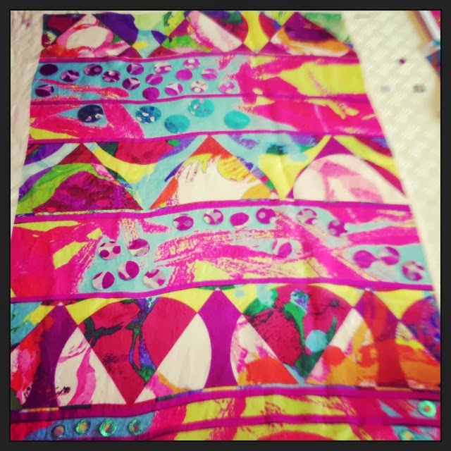
In this developed large scale drawing I have continued to experiment with working with both floral and geometric motifs together. In this piece I have tried to focus on geometric shapes using the same floral motif to add a consistency to the design. I especially like the texture the hand drawn dots have added and this aspect has added a great juxtaposition in scale within the design.
In this developed large scale drawing I have continued to experiment with working with both floral and geometric motifs together. In this piece I have tried to focus on geometric shapes using the floral motifs in different scaled stripes. I especially like the texture the hand drawn prepared stickers and geometric shapes have added to the design.
In this developed large scale drawing I have continued to experiment with working with both floral and geometric motifs together. In this piece I have used my developed digital designs to create the main geometric shapes of the design. I did this by using a folding mirroring technique similar to the one used to create paper snow flakes at christmas. I especially like the texture the hand drawn backgrounds have added within the design.
In this last developed large scale drawing I have continued to experiment with working with both floral and geometric motifs together. In this piece I have tried to focus on geometric shapes using a mosaic style of collage. I especially like the texture the hand drawn dots and prepared papers have added to the design. I also think the use of block colours has worked well to break up the busy prints being used.