Monday 31 March 2014

New Floral Inspiration

I have been using Pinterest to help me gain new inspiration for my floral designs. I want to continue the theme of abstract florals introducing block shapes inspired by the work of Amanda Briggs. I feel that larger scale patterns will suit this style best below are some images which I feel show the effect I am hoping to create.


Combination of simple block motifs with layered petal designs.


Large abstract floral shapes created through block colours.


large scale overlapping and repeated motif


Mark making and textured motifs 


Simple shapes combined to create floral designs which are abstract and playful.


Refreshing Geometric inspiration

I have been looking at New Geometric inspiration looking at new forms and shapes for checks to stripes. I am keen to develop Geometrics with Floral motifs in a subtle way within some of my scarfs, in particular by using devore. I have also been looking at scale Since my tutorial with Allison I am keen to develop geometric motifs on a larger scale within my designs.


Scale and checks


Bold print on a large scale with 6 colours.


Devore grid leaving a check.


2 colour mark making square pattern. Simple yet effective on a large scale.


adjacent stripes


Structured stripes and mark making using black and white with bold colours.


changing the direction of a print is a very effective juxtaposition.


New Black & White Inspiration

I have been looking at New imagery for my Black and White project, I find this helps to keep Ideas forming and keeps imagery feeling fresh. 


Experimentation with scale and inverting of a pattern.


Large scale to smaller scale print with more structure.


Change of scale and motif. A combination of mark making and block defined motifs.


Reflective black used with a white fabric, I like the way the black is catching the light highlighting shadows and folds of the garment.


Geometrics combined with texture.


playful change of motif and scale.

New Inspiration

While in Pinterest I came across the work of Amanda Briggs. I really like the simplicity of her prints, this combined with her bold colour palettes works really well to create eye catching floral designs.


I really like the collage style of theses prints. I am keen to use tis idea within my new Floral drawings for my scarfs. I am hopeful this technique will create some unique motifs which will be suitable to the context of fashion scarfs for women.

Discharge Printing

Last Friday I was in the print room developing my velvet designs. After Stew I decided to drop digitally printing onto velvet and to experiment with printing directly onto velvet using devore and discharge techniques.


Finished samples


I began by devore this samples first, for some reason this didn't work very well with fibres of the velvet not burning away as shown in the image below. I repeated the devore and was still left with the fibres, which I was disappointed with. Next I discharge the same pattern but on a smaller scale into the samples. The discharge dye I used was meant to be pink but the discharge was too strong and burned the dye away reverting back to a clear paste. Although this wasn't the effect I was wanting to create I am pleased with the effect created. This sample was inspired by a scarf designed by Lee Lapthorne which we were shown in his lecture last year.


Fibres remaining after 2nd devore attempt.


With this sample I used clear discharge first to print the dots, I then steamed this and washed the remains of the discharge away.  With the Pink discharge not working on the first Sample I changed the dye I used testing the colour before printing onto the sample. I am really pleased with the bold colour of this pink it create an interesting contrast with the black and white of the sample.

I am really pleased with these experiments, I feel that velvet isn't the right fabric to use for my scarfs. I am thinking that I may develop this technique of discharge using silk creating a couple of my scarf designs. This is something I need to think about but it is a possible idea.

Sunday 30 March 2014

Trends

I have been looking at Trends, as I want to keep my designs Modern and up to date with current trends.  I find that by doing this I am able to take influence from the trends within my designs.


This reminded me of my black and white samples. I like the flash of colour they have used, I think this idea might work well as a boarder to my black and white scarf designs.


I think the use of pastel tones is really delicate against the floral imagery and is something which i think I may introduce into my design create a contrast in colour.

I really like the blocks of colours which are created through collage. It is a technique which I enjoy to use in my work to create patterns. It is encouraging to see that it is an up and coming trend within fashion print.


This trend of squiggles reminded me instantly of Zandra Rhodes iconic wiggles. They work great as a break up of pattern and as a filling to connect patterns together. I am going to use this theme within my new geometric designs creating a new dimension and a link to a current trend.


These trends show that I am working towards a collection of designs which will fit into current and upcoming trends, with my designs being inspired by the 60s.

Tutorial With Allison Willoughby

On Tuesday afternoon I had a Tutorial with Textile Artist Allison Willoughby. This went really well and she was very complimentary about my work which is always lovely to hear. I discussed My plans for the coming weeks and my plans for the degree show and when I graduate. 

Things that we discussed:

  • Using different materials to digitally print onto: This is something I know I need to address and is something Nick discussed with me in my last tutorial. ( I  spoke to Niel about this asking which fabrics he suggested for digitally printed scarfs, From this discussion I have decided to have some of my scarfs printed on Both silk satin, silk satin viscose( which I can devore) and wool)
  • Market research: Allison suggested that I look at scarfs which are being sold at the moment, looking at scale of print, materials used and size of prints. ( I think this will be very helpful, to the designing of my scarfs.)
  • Scale: Allison pointed out that the spots in my design get smaller in scale but don't go very large in scale. This is something which I am going to address and go bolder with the spots I use increasing their scale.
  • Introduce tonal colours: Allison suggested I use tonal colours within my designs, as a large colour palette will not be to every ones taste. I really like this idea, I will do some colour research before I introduce this into my work.
  • Scarf design layouts: I showed some of my initial scarf designs to Allison, she liked an edge design I had created suggesting that I create scarfs that have all the patterns at the edge and a blank centre. I liked this idea I thought that within the block centre of the scarf I may devore patterns into the fabric to add a subtle pattern.
  • Foiling on a scarf?!: I asked Allison's opinion on the use of foiling on a scarf. She said that I could use it but would be best in small sections as to prevent irritation to the wearer. 
  • How many scarfs?: I said to Allison I was thinking about making 10 scarfs for the degree show she said to make 30! I think that would be sadly out of my budget. I am aiming to create between 10-20 scarfs. The quantity will rely on budget, time and designs.
  • Selling price: the last thing we discussed was the selling price of my scarfs. I suggested the same as the scarfs I sold at the Norwich scarf event in year 2 which was £95, Allison said I should raise this price as I now have more experience and as they will be my graduate pieces. She suggested I sell them for at least £120. If you sell anything at the degree show the university take 25% of the sale so this is something I will have to factor into the price.


Developing Devore

On Tuesday I was in the print room before my tutorial. I was working to develop the Black & White samples which I printed last week. With these samples I wanted to develop my both devore and foiling,  focusing on placement and how they can work to enhance a pattern. 


In this first sample I experimented with composition and placement, using newsprint to block sections of the pattern created a layered design which I feel has been successful. This design was created from 4 different layers of printing.


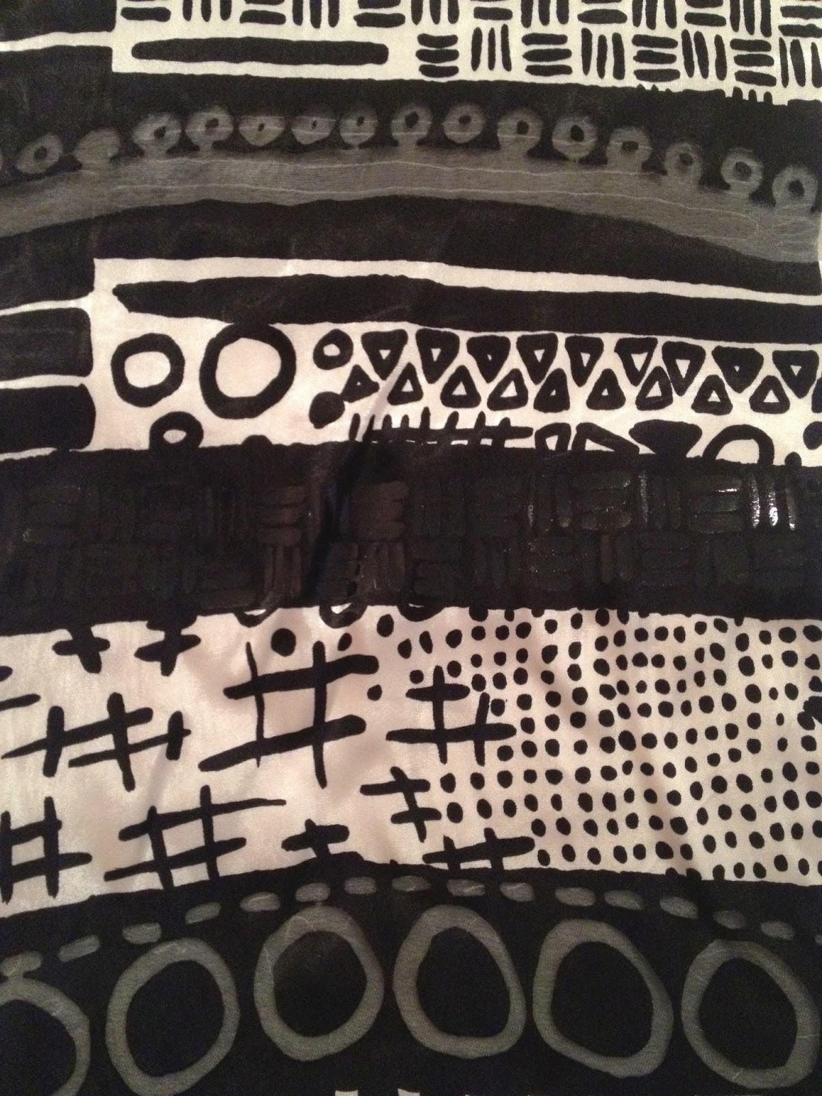
In this second sample I experimented with devoring patterns into negative space, and placement of devore to create depth to the sample.


In this third sample I experimented with creating a linear pattern working in stripes of patterns. I think this has made an interesting pattern but I feel it is the weakest of the three designs which I have created.


I love the black foil on a block of black dye, I feel it creates a subtle effect which is highlighted when caught by light.


I think this placement of devore has been really successful. although this design is simple I feel it looks very effective.


On this design I printed a layer of spots first, when I devore the section away this silhouette design was left. This is a happy accident, I think the effect is really interesting and adds a new dimension to the sample.


Close up of black dots.

I feel that this experiments have been successful and I am planning to develop these into some of my scarf designs for the Degree show.

Sunday 23 March 2014

Creating New Digital Designs

With the Easter Holidays approaching I have been thinking about my final deadline and the degree show, which is just 4 weeks after the Easter Holidays. Im not going to lie that is a scary fact! We had a lecture on Thursday from a past student who now works at Cath Kidston. I found this such a helpful Lecture filled with excellent advice. 

Although I would say that I mostly design for the context of fashion, I am always dubious to force my work into a specific context. In the Lecture on Thursday Sally Wood suggested that at this stage it is not necessary to show work when displayed as a specific context, Instead just show the design off to its best like I did at Stew, Enabling the viewer to pick the context of the work. 

I really like this suggestion it made me feel relived as this was something I was worried about for the Degree show. Nick had suggested I make fashion outcomes showing my designs made into fashion Garments like I did for Ba7. I have to say that this was not something I was keen on. At the degree show we have the opportunity to sell our design, taking this into consideration I have decided to create a series of scarfs, similar to the scarf I made for the Norwich scarf Competition in year 2. This will allow me to show my design and at the same time be something I can sell, creating the best of both worlds.

I have started to experiment to create some Initial designs experimenting with how my designs might work as Square Scarfs: 


 I am really pleased with this above Design, so much so that I think I will make it one of my final designs. My plan is to have it printed digitally onto Silk Satin Viscose. i will then take the design into the print room using devore on the white squares leaving that area of the sample sheer with a bold edge and the check and flowers siting on the top. I think this will make a really interesting effect.