Tuesday 22 April 2014

New Geometric Marks

Today I have spent the day working into close up sections of my floral drawings creating designs for my geometric scarfs. To do this I have used collage techniques along side stickers and felt tip pens.
While creating the drawings I looked the images I took yesterday at the V&A looking at the geometric shapes and lines I saw and applying this to my drawings. I feel that this helped having fresh imagery for inspiration, it allowed me to move more geometric patterns forward.
I also took inspiration from Camile Walala who's work I came across on Instagram. I tried to use her idea of continuous lines within my geometric designs giving them flow and structure.

Here some images of the geometric drawings I created today:


My plan is to develop these drawings into digital design using photoshop, I am planning to do this tomorrow and  I am hopeful it will work well and I will be able to create some really interesting b and w geometric designs for my scarfs.

London: Part 2 Market Research

While In London yesterday I took the opportunity to do some market research for the scarfs I am creating for the degree show. I looked in both Selfridges and Liberties focusing on the following:

  • Materials used
  • Layout of pattern
  • Display
  • Colour
  • Scale of print
  • Techniques used
Here are some images I took showing my Findings in both stores: 


I found this research really helpful and have come away with lots of ideas. The visit also made me feel more secure in my current designs and has given me the confidence to carry out my ideas. I am excited to create the rest of my designs and am hopeful that my scarfs will reflect the research I have carried out.

London: Part 1 The V&A

Yesterday I went to the V&A to visit the Italian fashion Exhibit. I really enjoyed this show I was unsure if it would add my current project, but it did. Sadly I wasn't aloud to take images inside the exhibit or do any drawings. I did jot down a few Ideas that I got from the inspirational items. I bought postcards from the gallery shop which showed some of the inspirational pieces from the exhibit. Many of the designs and artist linked to my research report, and allowed me to see other designers work from the 60s seeing how their work has developed through the years.


Guanahato dress by Roberta di Camerino from the late 1960s 
I really liked the use of colour and mark within this garment.


Emillo Pucci patterned silk suit from the 1960s
I love the combination of geometric shapes with floral motifs in this agreement. The bold colour palette allows the garment to have that fun and playful charm that many 60s garments have. 


Pino Lancetti tropical print dress on silk chiffonfrom 1976.
I really like the use of tonal colours within this design with an accent tone of tomato red.


Missoni machine knitted jumper from 1971.
I really like the structure of this design, despite the design being busy it really works this is something I strive to achieve within my work.


Mila Schon Matelasse coat from 1966.
I really like the geometric quality of the floral design upon the coat I think it is very interesting to look at.

While at the V&A i also looked at the fashion and textile exhibit looking at the 60s display they had.


I really liked looking at this particular display as it showed the work or Celia Birtwell, Zandra Rhodes and Barbara Hulanicki together which was great for me to see as these are the 3 pioneers of the 60s I looked at within my Dissertation. I really enjoyed seeing their work in person I focused on the colours, motifs and materials they used. 

I also took images of the Asia display looking at item which I felt inspired by for their geometric ahpes and lines.


Photo Shoot

On Wednesday I went to sit for my portrait images taken by Martin Grayling who is the photographer that took the images of my work on my blog. I did an exchange with martin I said I would sit for his portrait series in return for images of my textile work.

Im not going to lie I was very nervous leading up to the shoot, as I don't really like having my picture taken. Despite this I really enjoyed the experience and I was lucky that martin also took some images of me with my work, which will come in handy for job applications and my website.

Here are some images from the shoot.


Ikea

On thursday I went to Ikea with my family hoping to find inspiration and ideas for my display at the degree show. I have to admitted that by this point of the Easter holidays I was worrying about my progress of work. I have found that ideas are taking a lot more working out than I had anticipated. I am very thankful while at Ikea I had flurry of idea and left with everything for my degree show display. 

Despite the fact I am creating scarfs, I have decided to go for an instillation style of display which is quite conceptual, I am exciting with my plans and I feel it will show an interesting display that will attract attention. (fingers crossed)


Sunday 20 April 2014

Scarf inspiration

While in Debenahms this week I saw this bed cover on display the layout of the design was really interesting and I feel the idea could work well within my scarf designs. I am going to try and use this idea within my designs and I am hopeful it will be as effective.


Scarf Designs

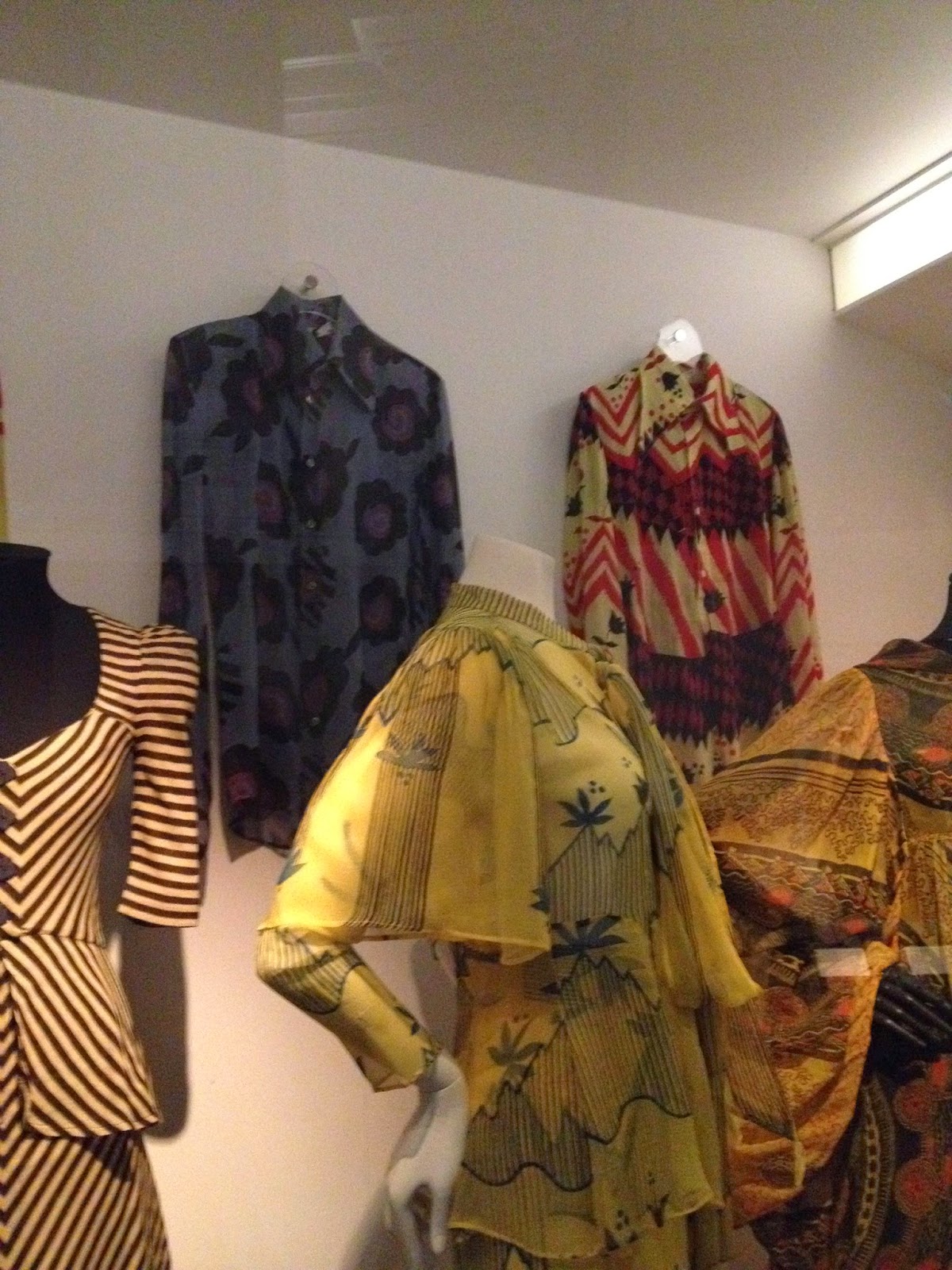
Over the past week I have been working hard to create my scarf designs for the degree show. I am planning to create both square and long rectangular scarfs on both wool and silk fabrics. While creating my designs I have been thinking about composition scale and layout. I have been looking on the internet at Liberties looking at scarves on their website for inspiration. On Monday I am going to London to do some further market research.

Here are some images of some of the designs I have made, some have been more successful than others and these will be the ones I will have printed.


I really like this first one I have tried to stick to 3-4 colours in this design making it more commercial. I plan to have this printed on silk satin at the size of 100cm by 100cm.


This was the first design I created I have tweaked the colours slightly but overall I really like the design. My plan is to have this printed on Silk Satin Viscose then I will devore the white squares away leaving the grid with the florals design. I am hopeful this will create a really interesting look.


In this design I have tried to experiment with scale and colour. I have used the same design in the middle and the edge but I have changed the scale and colour of the pattern creating a juxtaposition. I plan to have this printed on Silk satin at the size of 140cm by 140cm.


This was an experimented I created with some of my ideas following my tutorial with Allison willhoughby. In this Design I have experimented with the idea have the pattern as a border with the main part of the scarf being a large block of colour. I then plan to devore the white large dots out of the design giving the material 2 thicknesses. I like this idea but I feel that a different design would work better using this concept.


In this design I tried to experiment with colour and scale contrasting black and white with my bold colour palette I think the idea is good but I don't like this design. 


This finally design is using my favourite Black and white Design from the Stew Exhibit. I really like how this design is going It is still in the process of being created as i am putting the dots long the centre border. I am hopeful that this will look really effective when completed. 

I am as of yet to start my long scarf designs, I am wanting to use my market research in London to inform these designs in particular the scale of print and the size of the scarf its self.  from my current market research I have not seen any long silk scarves so my current plan is for the square scarves to be silk and long scarves to be wool. this plan may change after Monday depending on my findings in London. 

I am planning on creating A1 samples which correspond to some of my scarf designs. I plan to use the same designs maybe in a different colour or scale developing them through devore, dischrge and foiling techniques in the print room. With these samples I plan to create Garment fronts showing my design in another context. 

here are a few design I have so far:


This first one needs the colour reworking as it currently doesn't look right to me. 


I am going to create new screens which I will use to work into the prints further like i did with my stew samples. I am going to use bias binding to show this designs in a fashion context. I have done this in previous projects and I feel it works well.