Thursday 30 January 2014

Displaying work

On sunday I filled out my form for the mid-term review at the stew gallery. This got me thinking about displaying my work, and the different ways it can be done. I know that this is a very important part of the design process, as it how my work will be viewed by the public. 
Something I am keen to display within my samples this project is the versatility of them showing how the designs are all different but at the same time showing they can all interlink and work as a large collection.
For the Stew Gallery exhibit I am aiming to display 5 A1 samples, these will on a selection of fabrics and will show all themes that I am exploring in this project. I was going to show the samples in context by using bias binding, however I thought this through and decided at this point of my project I am more focused on the design than its context. 
I have using Pinterest to look at different ideas of displaying my pieces. Below are some images of ideas I think could work for either Stew, The Degree Show or New Designers ( if I get picked ! FINGERS CROSSED) 


 I really like these ideas of displaying fabrics together in a draped way, I think it always for the colours of designs to be clear and for the motifs to stand out creating both a contrast and harmony.  I am very keen to display my work at the degree show in the style of the image above, I have said that I am going to make 3 lengths, 1 for each collection. I think this would be an affective way of displaying my lengths its simple and allows the print to speak to the viewer.

Saturday 25 January 2014

Drawing Abstract Florals

This week I have begun to use the inspiration I have gathered to inspire my floral drawings. I have used a range of media experimenting with watercolour, gouache, fabric paints, wall paints, inks, biro, and felt tips.

Below are images of some my drawings:

The above drawing is a mono print using a combination of different paint types, I tried etching into the paint before printing the mono print, i did this to add texture it didn't work how I planned but i think the end result is good.


The above drawing is a felt tip drawing using kure colour felt tips. I have tried to simplify the floral motif just drawing key aspects. I used two tones of colour to add depth to the design, I am hopeful this design will work well when developed on the computer. 


This drawing and the one below are both mono prints to create both of these I used a paint brush and painted straight onto acetate. The above image I printed the design twice hence why the second is paler in colour. I feel the experiment of using more than one colour worked well in the above design. In the drawing below I am pleased with the finished drawing I like the effect the mono print has created in particular the texture.


Both the drawing above and the one below where created using a combination of watercolour, gouache and ink. I really like the different tones of colour which I have been able to create. I would say that these drawings have been successful but i feel they are more realistic representation of florals than abstract.


This drawing above was created by looking directly and flowers and cutting what I saw out of paper. I was inspired to do this from the 60s patterns which I have been looking at. Most of the design are very simply block shapes and this above drawing is my interpretation of that. I feel this has worked well and I am keen to continue to develop this drawing style.


 In both the drawing above and the below I have used felt tips to create mark making drawings of florals. I was inspired to do this from my visual research of abstract styles of floral drawings. I am really pleased with both these drawings, I think they look really interesting and show my theme of florals in an abstract style which is exactly what I want to achieve.


This drawing above was inspired by the Collier Campbell Archive book which I recently bought.  I have used a combination of watercolour and gouache. I pleased with this drawing in particular I like the way I worked into the negative space with the blue water colour I feel it has finished the drawing off.

This coming week I am going to continue to draw florals, using ideas that I feel have been successful above.  My plan is to scan some of my drawings in and then print them out and work back into them developing them further. This is something I did in Ba7 and i feel it worked well.

For my Geometric drawings I plan to use a view finder to take pictures of close ups of my floral drawings, I will then print these out and then work back into them using geometric marks and shapes. I did something similar to this in Ba7 and I am keen to develop the idea further. I feel by doing this my theme will blend well together.

Collier Campbell ...... Feeling Inspired

When I got my feedback for Ba7 it was recommended that I look at the book The Collier Campbell Archive. I had been previously been introduced this book when I was on my placement with Lucie Summers. I received some book tokens from christmas so decided to invest in the book.


I can say that this book has been a true inspiration. The way the patterns in book show pattern and texture is really interesting. I have particularly enjoyed looking at the floral designs.


With these floral designs I have been inspired to use and develop my abstract floral motifs with paint using watercolours and gouache together. It has also made me look at the flowers I am drawing with a more simplistic point of view. Looking at the basic aspects of the flower has allowed me to create more abstract imagery which shows clear inspiration from Collier Campbell.


I also looked at the way they created Geometric patterns, I found their designs to have bold colours making them feel very playful. I also enjoyed looking at the way they have experimented with scale within their designs creating a contrast within the motifs they where creating. This is something I am keen to develop within my designs, I believe that scale can play a large part in the success of a design.


Drawing Inspiration

Within Ba8 I want to continue to create Floral abstract motifs, I feel this style is in keeping with my 60s theme. To do this I am going to continue to use mono printing and other successful aspects of drawing which I used in Ba7.
To start with I used Pinterest to gain some inspiration, for this I focused on marks used and how layers of colours have been applied to add tone and texture to the motifs being drawn.


In this drawing and the one below I like how the artist has used thickness of line within mark making techniques to create depth and detail with her drawings. I also really like the abstract qualities her drawings have. The textures she has created through mark making are really interesting and would work really well when developed into a digital print.


In the drawing above I love how the artist Lily Pulitzer has worked with negative space and different tones of colours to create an interesting floral motif. I feel this method would work well when developed using CAD. In the drawing below I like how the same artist has used different tones of paint to create shadow and tone of the petal of the flowers. I also like how she has filled the background with a brush of colour.


Within my drawing I have also taken inspiration from designers and high street brand textile designs:


These first two pieces I have taken inspiration from are by Zandra Rhodes, I discovered these pieces when doing research for dissertation. Rhodes is one of the 60s designers I have explored. These dresses  are from her sketchbook collection which was for Spring/ Summer 2013. I really like the motifs she has used within these designs, in particular the way she has used inks to create tone through mark making. The image below shows her iconic wiggles which she is known for. I like the way she has used dense and sparse areas of the motif she create a contrast in both scale and tone within the design.


This image above continues to inspire me. It is from Matthew Williamson spring ready to wear collection 2014. This piece was my initial inspiration for Ba7 and it has continued to inspire me within my drawings for Ba8. Im not sure what draws me to this design, I think it is possible its simplicity. It appears as if it could have been drawn by a child, it has a playful quality to it which I love.


This image above is from Topshops Spring Summer 2014 collection. I adore this print the use of texture is really interesting and the contrast of pastel tones of pink against black is really effect. I am keen to use this idea of texture within my designs. I think it works effectively within a digitally printed fabric.


Trends

As part of my initial research I have been looking at trends, focusing on how my work can be suited / fit within the current trends for textiles for fashion.
I have to say I don't usually focus on trends, I tend to find I am influenced by them unintentionally. I read a lot of magazines and love to shop so am constantly viewing trends and I think that these observation tend to inspire my creative process. 

Below are some trends which I feel my work for Ba8 can fit in to: 

These first trends where taken from the online shopping website Boohoo


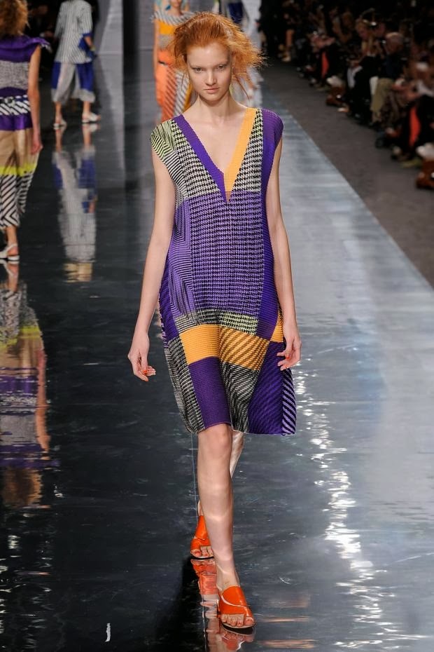
I felt that this first trend, summarises exactly want I want to achieve within my geometric prints which will be inspired by the 60s. The trend which is called Flash Mod is taking inspiration from the 60s and discusses the eye features as bold pops of colour and placement prints. These are 2 key aspects of my project and are both themes I am wanting to explore and use within my work.


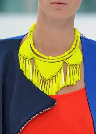
This second trend Chalk Pastels, I liked the colour pallet, I felt the colours had a fresh and vibrant feel to them and would work well towards a selection of fashion fabric designs. I particularly like that in the write up of the trend it spoke about a metallic twist, I my project I am keen to continue to use foil as an embellishment to my samples. I feel that folk can add both depth and texture to a fabric.


This third trend I felt summed up My idea of print with print in particular Florals. The trend talks about pick and mix patterns, this is a theme I am aspiring to within my three collections. I am hopeful that my designs will all be unique but work together as a collection.

These next trends I have sourced from Pinterest:


This first trend caught my eye through the combination of prints. I like the way they have combined nature inspired prints with geometric marks in this case circles. I think the unstructured uniformity of the geometric shapes works well with the organic nature imagery. In Ba7 I began to think about geometrics in a less structured sense, by this I mean using marks to create shapes e.g. using lines to create squares etc.  I am going to experiment with this idea as this trend shows it works well with nature inspired imagery which my flower power patterns will be.


In a similar way to the trend above I like the way this trend shows a combination of flowers with geometric shapes and lines. This trend in particular focuses on placement of motif, this is something which I am keen to focus on in my project. Placement of motif was key in the 6os and as can be seen in this trend it is still key with textiles for fashion.


I liked this trend for its combination of texture and tone with a floral print. I think the contrast between tone, texture and structure within these designs is really interesting. I am keen to focus on texture within my prints, with them beginning digitally printed, I am scared of them feeling flat. I feel through texture of marks within my drawings I will be able to add depth to my designs in a similar way to this trend.

In these last trends which I have taken from Pinterest I have focused of colour:


This first trend is a colour palette for Spring / Summer 15 in is inspired by holiday hues of colour. I really like the bold contrast of the colours this is the contrast I am hoping to create within my designs.


This image above is the Pantone colour of the year. I became aware of this through the US tv show Project Runway All Stars, in Which the contestants had to use this colour and create a new fashion trend for Spring/Summer 14. I am keen to try and incorporate this colour within some of my designs. The image below shows the colour report from Pantone for Spring 2014.


I am keen to use this inspiration from these varied trends within my own designs, I feel this will help my designs fit within multiply trends and keep my work looking current.

Saturday 18 January 2014

Ba8 Inspiration


In this project Ba8 I plan to explore the theme of the 60s looking at flower power, bold colours and geometric shapes which all played a part in the iconic 60s print designs. I am planning to create 3 mini collections by the end of the project, these will all be inspired by the theme of the 60s.

I am thinking that I will split the collections by both colour and theme. The themes will be:
  • Flower power: this will use the floral imagery I create from my visual studies together to create abstract floral motifs that have a 60s aesthetic about them.
  • Geometrics: this will be inspired by my 60s research into geometric motifs. I want to develop the ideas I explored in Ba7 of create geometrics from both solid lines and shapes as well as through mark making.
  • A combination: within this collection I will combine florals and geometrics together, in the same way I did in Ba7.
The colour themes I am thinking of are:
  • Bold and vivid: this will be lots of hues and tones of colours together in-keeping with the patterns from the 60s. I will continue to use a similar colour palette to the one I developed in Ba7.
  • Black and white with a pop of colour: In Ba7 I began to experiment with using black and white monochrome colours together with a pop of a neon colour. I really liked the visual of the contrast between the colours and I feel this as a colour palette would work successfully.
  • A combination of bold and monochrome: this will be a combination of bold colours and monochrome shades. With this I am hopeful will have a clash of colours making an exciting visual for the viewer, making my pieces eye catching.

  • Below are some images which I am using as inspiration for Ba8:

Flower power inspiration


Geometric inspiration


A combination inspiration


Below is some imagery I am using as colour inspiration

Black and white with a pop of colour inspiration


Bold and vivid colour inspiration


I want for the collection to all be separate but at the same time my hope is that the three collections would have pieces which would be interchangeable. Within my three collections I am going to focus on scale and placement of motif as these were both important factors within 60s designs. I really want to explore a harsh contrast in scale combining large motifs with much smaller aspects of design. I am hoping to create a clash in colours and motifs within all three collections I feel this is a theme I can see within pieces from the 60s and is something I want to bring to my work. I hope that will work to create interesting patterns and textures within my finished sample, showcasing my inspiration of the 60s in unique outcomes.